
More than just a fancy business card, legal website design can be a branding vehicle, an experience for clients, a sales machine, and an essential component of a law firm’s marketing strategy.
But the truth of the matter is, when it comes to website design, most law firms favor something within standards, rather than something outstanding.
We’ve scoured the Internet for what we think are the very best examples of legal websites – websites from strongly branded firms featuring a clean design, simple copy, and a sense of humor and style.

An actual homepage for a law firm…that works out of a barn? Only for barn enthusiasts?
So here are our picks for Best Attorney Websites of 2019.
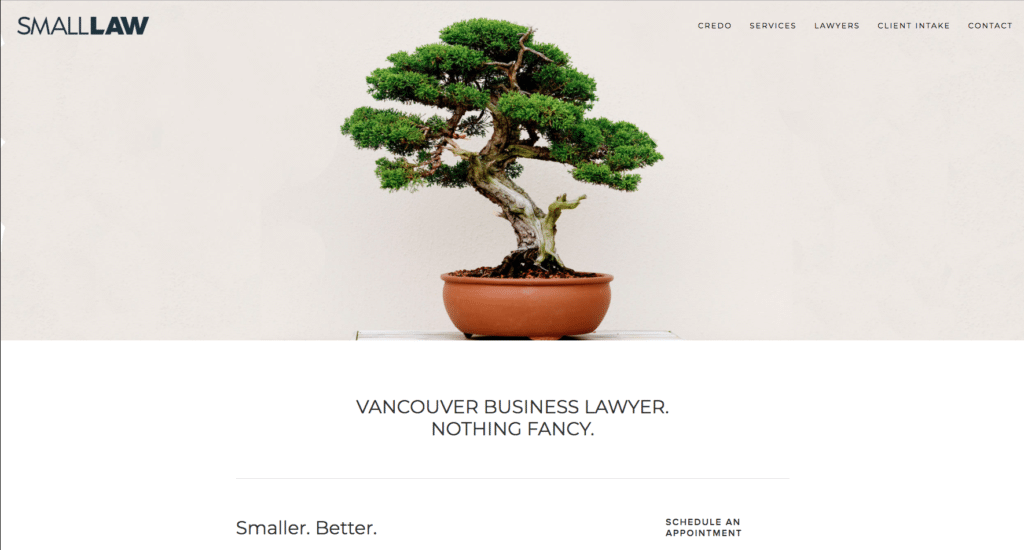
Small.Law
A brilliantly understated web design, Jeremy Hessing-Lewis, a Vancouver-based business attorney, has totally embraced his solo/small law firm identity and matched it with a spartan aesthetic to create this masterpiece of a homepage.
Responding to the oft-complained problem of “just being a number” that clients typically have when dealing with larger law firms, Small. Law cleverly uses design to positively frame the “small’ narrative and highlight the benefits of hiring a solo attorney.
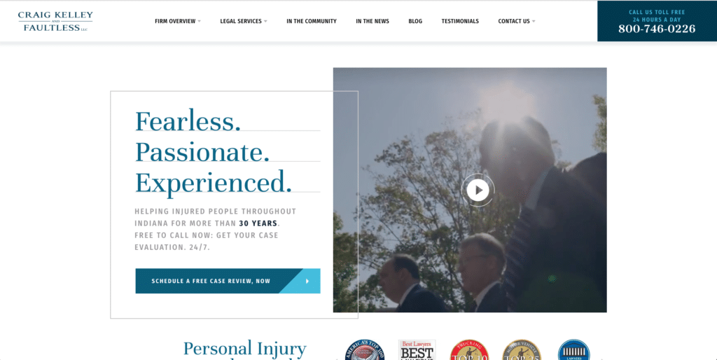
Craig, Kelley & Faultless*
This Indiana personal injury law firm’s website hits all the right notes – strong branding with a video, simple copy focused on the practice area, several points of conversion above the fold, and social proof iconography.
Another great example on Craig, Kelly & Faultless of focusing web design around a type of case, is the creative asset, Fatal Thursdays

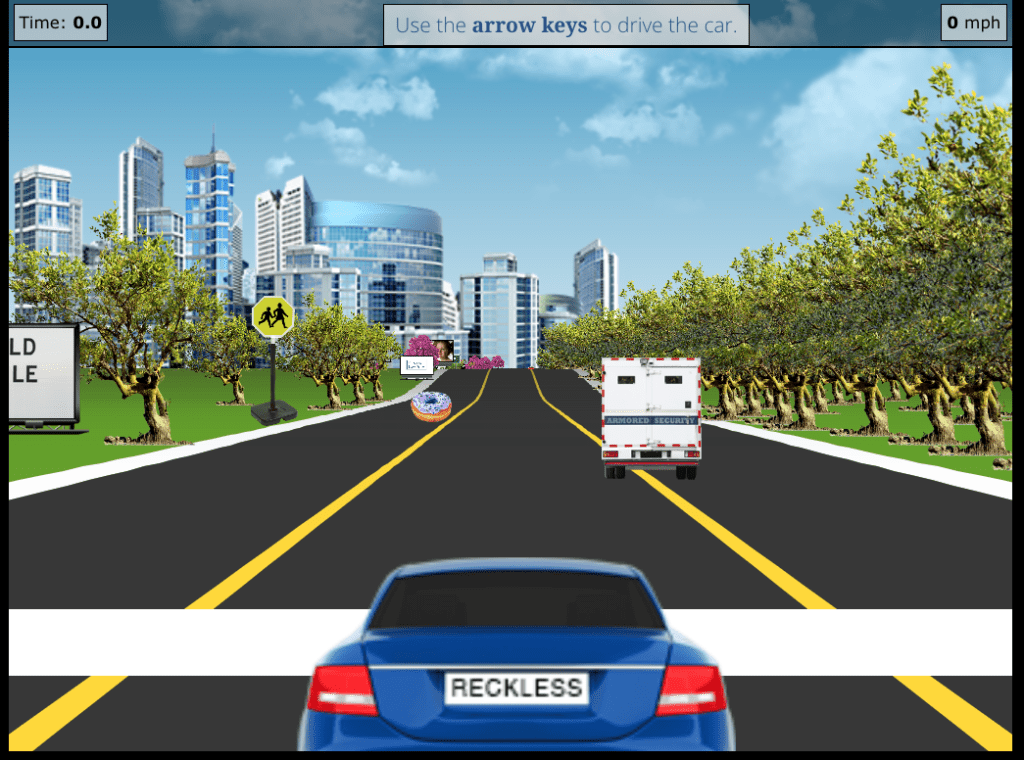
This immersive dive into statistics around trucking accidents in the state of Indiana, offering alternative routes, provides a strong signal to potential clients, and search engines alike, that this is the law firm to handle trucking cases in Indiana. *current client
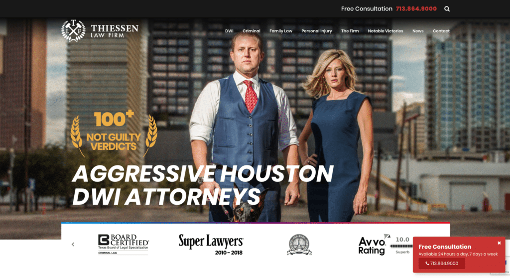
Thiessen Law Firm
One thing about being an attorney online is that you’re constantly being researched and vetted by opposing counsel, other law firms, judges, potential clients, and current clients. You have to maintain a certain level of representation and reputation management. That’s why the Thiessen Law Firm website is so boss! Pristine design, strong sales opportunities, and this bad-ass photo of the lead attorneys and a doberman? What’s so fantastic is that Mark and Taly embrace their brand, are 100% the nicest people on the planet , and they know this website has one job – stand up for them and represent their brand. Well done!
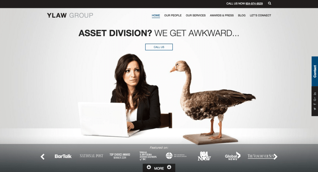
YLaw Group
YLaw Group, an award-winning Vancouver family law firm, states right on its homepage, “At YLaw we do everything differently, that’s why we’re successful.”In regards to their website design, you can clearly see they’ve embraced their mission to stand out. Extremely free of copy and reliant on humorous imagery, packed with points of CTA (calls-to-action), trust icons, and links prominently displayed, this design gets the nod, not only for the design itself but because the design sets the tone for the firm experience. So much more than a business card.
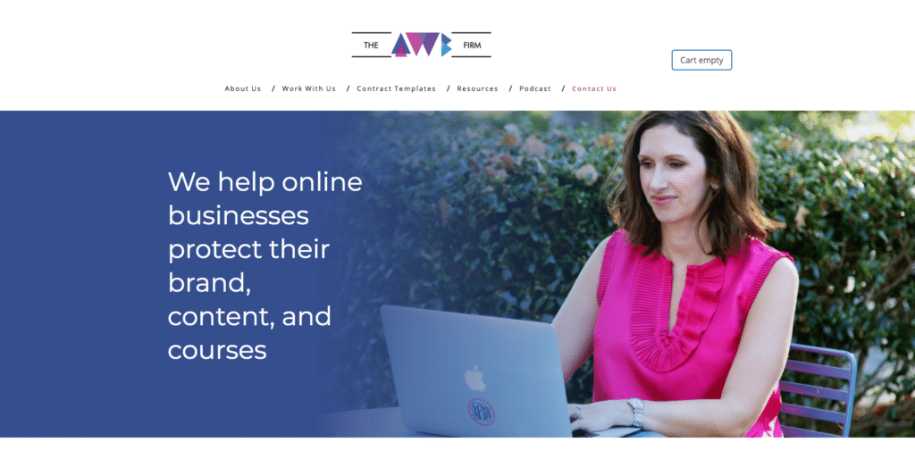
Autumn Witt Boyd Law Firm
Your website isn’t just a place to close the deal or get the million-dollar call. It can also be a place of education, connection, and a chance to close on a more important deal – a long-term (and billable) relationship with clients. Autumn Witt Boyd is a business and IP attorney working in Tennessee who has embraced content marketing as a business development strategy, as well as offering services not as a single template, but based on a client’s needs.
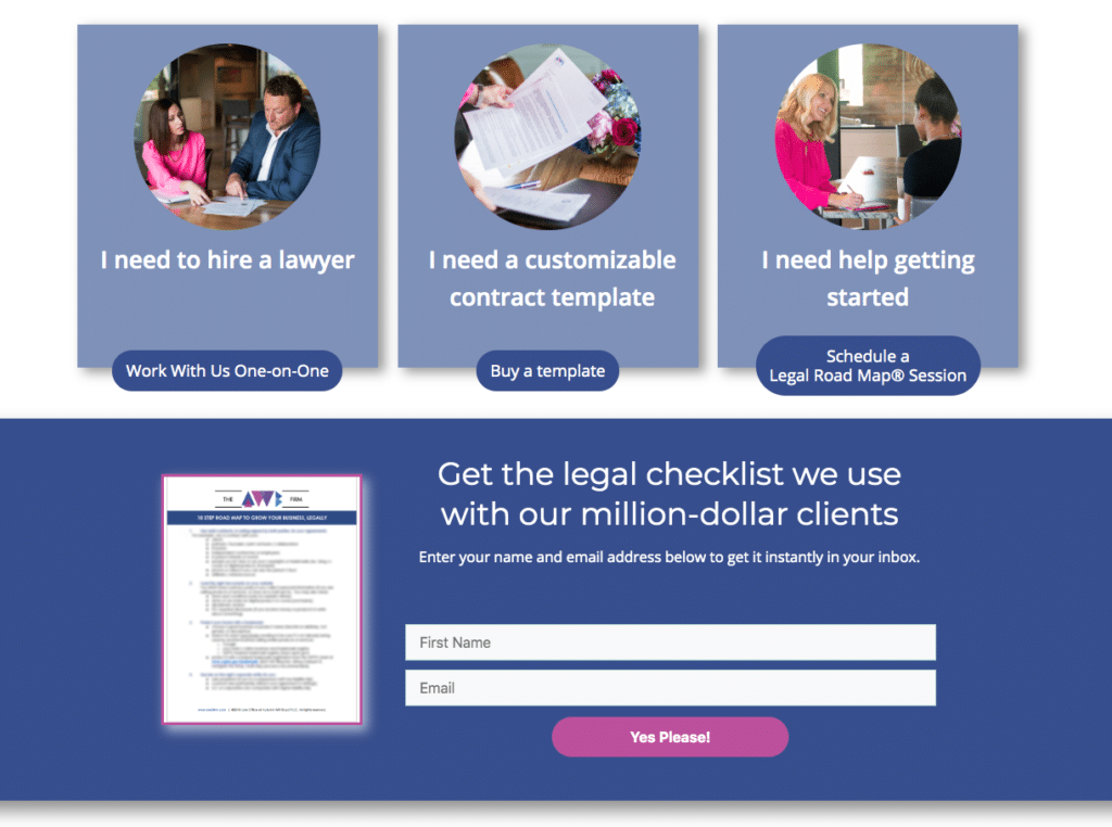
Instead of waiting to discuss options with potential clients, the AWB Firm provides guidance upfront with how-tos, videos, lead-generating templates for common business forms, and options for a more in-depth consultation. Your website is a chance for you to provide value upfront, and the AWB Firm captures this sentiment perfectly. If you’d like to hear more about how Autumn uses content marketing for her law firm, listen to her interview on LAWsome.
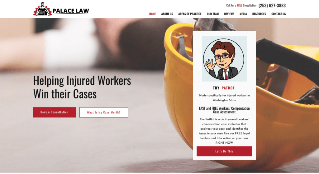
Palace Law
Patrick Palace, a workers’ comp lawyer in Tacoma, Washington, and the main shareholder of Palace Law, isn’t like most attorneys. In 2016, the Law 500 recognized Palace Law as one of the top law firms nationwide for its growth and innovation. Patrick has been president of the Washington State Bar and currently serves on the National Council for Bar President’s Executive Council. Whether on webinars, podcasts, (our podcast), radio shows, keynote presentations, or his own TV show, Patrick is an outspoken practitioner of law, and he has traveled the world spreading the legal gospel. His most recent project is a legal tech summit for lawyers. He also owns his own winery, Sunken Cellars, and preaches and teaches mindfulness and yoga.
So it’s little wonder that his website is a standard-bearer for attorney website design. Extremely simple and clean, visual focus on the practice area, several points of contact as well as an amazing chatbot called “PatBot,” which uses machine learning to gather intel on potential clients and provide them, if possible, with legal advice for their workers’ comp case.
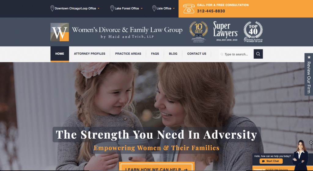
Women’s Divorce & Family Law Group
This Illinois family law firm has a fantastic website, a clear brand connection, elegant copy, and a strong focus on educational content marketing. Not only does the site have the classic distinctions of a high-converting landing page, there is an extremely useful graphic that outlines the firm’s entire process when handling divorce.
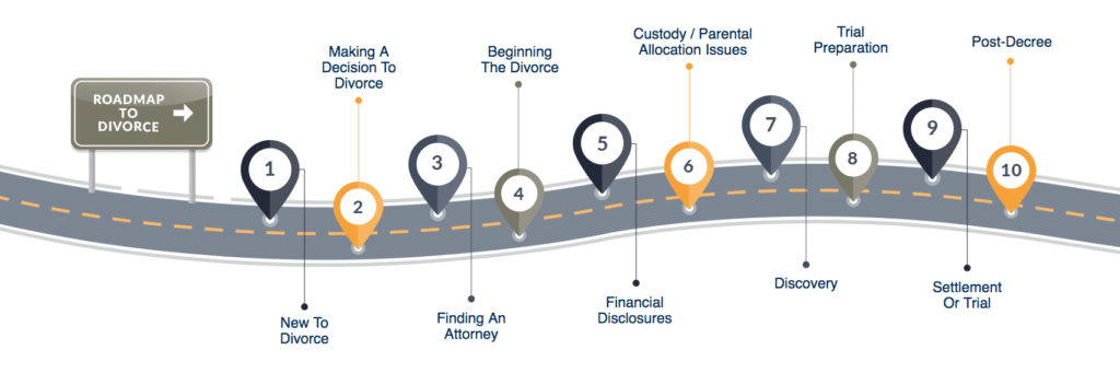
The firm’s Roadmap to Divorce is a fantastic example of how easy it can be to deliver value and education when design and marketing combine. Not only does the roadmap help current clients, but it can also help potential clients correctly set their expectations earlier in the case process, saving innumerable staff hours explaining the process again and again.
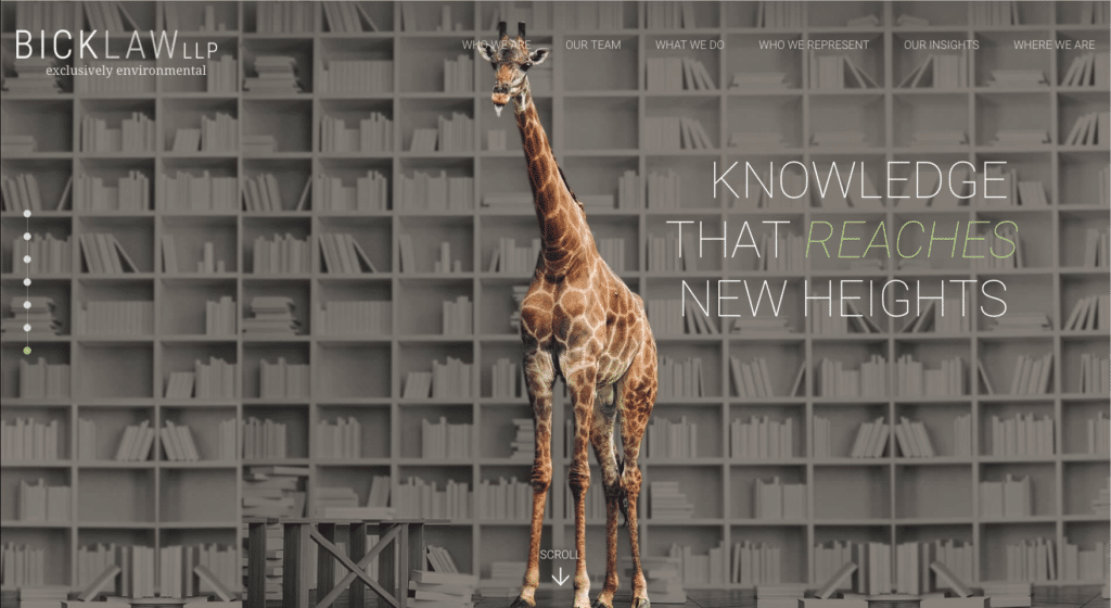
Bick Law LLP
When stunning natural photography and graphic design meet up on this California environmental law firm’s site, it’s plain to see why Bick Law’s website is the perfect site to close this year’s honorees.
With an amazingly playful focus on their practice area, Bick Law combines their taglines with nature, the environment, and the human world to create an intoxicating blend that just works.
With a very pristine design, and super clean, strong, bold, branded copy paired with high-contrasting images, this website is the perfect illustration of what an attorney’s website could become.
Interested in an award-winning web design for your law firm? Click here to learn how Consultwebs can help, or Get In Touch! Want more content on law firm marketing? Sign up for the Consultwebs newsletter, follow us on social media, and subscribe to the LAWsome Podcast.

